Great Content From Stand Up Maths Benfords Law Dodgy Scatter Graphs And The 2020 Us Election
Great content from Stand-up Maths: Benford’s Law, Dodgy Scatter Graphs and the 2020 US Election
The internet is full of misinformation about the 2020 election (and about most other topics as well), and I was really interested to see one of my favourite YouTubers, Matt Parker of Stand-up Maths http://standupmaths.com/ , weigh in on the subject of dubious statistics. Normally elections wouldn’t be in Stand-up Maths’ bag of tricks - most of their videos are about fun mathematical puzzles, games and curiosities. But it looks like his patrons asked him to take a look at a couple of claims about electoral fraud…
What’s interesting about these cases of “statistical fake news” is that the data isn’t fake - you can check it yourself. But the conclusion that the data is clear evidence of fraud . . . well, that’s a lot less convincing once you take a look at the maths.
Benford’s Law
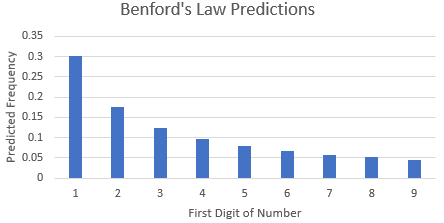
Matt’s first election-related video deals with the fascinating Benford’s Law. This is the observation that, in many sets of numerical data, the numbers are more likely to begin with smaller digits than larger digits. Often about 30% of the numbers will begin with a 1, while less than 5% will begin with a 9.
Benford’s Law has been shown to apply to a wide variety of real-world data sets and has even been used to detect financial fraud. So why not apply it to the 2020 election to detect fraud there? Matt Parker does a great job explaining the pitfalls:
https://www.youtube.com/watch?v=etx0k1nLn78
All credit for this video goes to Matt Parker (Stand-up Maths) - check out more of his stuff here https://www.youtube.com/user/standupmaths
Scatter Graphs
I have no idea why someone who didn’t want to deliberately mislead people would post the kind of graphs Matt Parker talks about in this video. In the first video, you can see how misunderstanding Benford’s Law and when it applies might lead you astray with a dataset where one candidate’s data follows the Law and the other one doesn’t.
But in this case, there’s no underlying phenomenon here, there’s just some very dodgy choices about what to plot where on a scatter graph, and how to interpret your results.
https://www.youtube.com/watch?v=aokNwKx7gM8
All credit for this video goes to Matt Parker (StandUp Maths) - check out more of his stuff here https://www.youtube.com/user/standupmaths